Preface…
At Black Mountain, we want to help people understand what is going on in the world and the economy in a more hands on and simple way than most companies or experts will give to you.
For this reason, we have put together and are sharing an article and several models, or frameworks, that we have put together to help think about the present moment in terms of the economy, specifically, the US economy.
Our top down and bottom up approaches analyze the past and compare the current state of the markets to previous cycles (where possible). Observing and analyzing the past and comparing it to the present in order to find opportunities for the future, or “back testing” is something we, and many of our favorite economists like Ray Dalio, practice in order to make investments decisions with as much accuracy as possible.
Although we use the term “models” here as a general framework for thinking, we do provide a number of Excel models throughout the article that back up our thinking with linked research and additional numerical insights…
Understanding the macroeconomy…
Our first model isolates the three most recent government spending bills and compares them to three bases of evaluation for a discussion about inflation. A top down approach.
The second group of models utilizes several current and past company metrics to establish reasonable valuations based on cash inflows and outflows. A bottom up approach.
We use these models to discuss relative value created and lost over the last two years; we then zoom out and discuss where we think valuations and inflation could end up accordingly.
Before getting into it, we want it to be abundantly clear that nothing put forward in this article or the models should be considered financial advice. None of us are licensed and this is merely the output of our research and thinking that has been developed over many months.
We link and mention numerous reputable sources throughout this thought discussion that have helped guide and cross reference our thinking.
Understanding and Contextualizing Money
Before zooming out to the entire US economy and dollars in existence, let’s look specifically at the last two years, even more specifically at the three spending bills that have been passed between our last two presidents.
- Trump’s $2.2T “CARES Act” which passed in March 2020.
- Biden’s $1.9T “America Rescue Plan” in March of 2021.
- Biden’s $1.2T “Infrastructure Bill” in November 2021.
Between these three bills, there has now been ~$5.3T spent just since the start of the Coronavirus pandemic in March of 2020. For reference, Obama’s largest bill was a $1.8T Tax and Spending Bill in 2015. Before that, it was “The Recovery Act,” which passed in 2009 as a response to The Great Financial Crisis, was ~$830B.
Now without getting political at all, we would like to analyze and discuss the theoretical impacts of this spending purely on the economy.
How much wealth has been lost since then in the recent crashes? How much productivity and benefit was driven from this spending? Did we overdo it and if so by how much and in what ways? How do we not overdo it again? Can we fix it? Is what the Fed is doing now enough to stop inflation, or are they doing too much, and could it be met with something much worse? Is the dollar in a strong or weak position currently? Is there a soft (or at least safe) landing from here? Is it possible that more spending could help get productivity back on track?
To analyze this, we will look at total household wealth, M1, and dollars in circulation over time. We will also look at some numbers behind massive economic players like Apple, Tesla, Amazon, and more…
To begin, it’s important to zoom out and look at all money….
An interesting place to start is the total household wealth in America, this includes liquid all the way to very illiquid money or value held by Americans. Since the equation is total assets minus total liabilities, it does not include debt, so we believe this is an important and interesting number to look at and can be a reasonable basis of calculating the long term inflationary impacts of recent government spending.
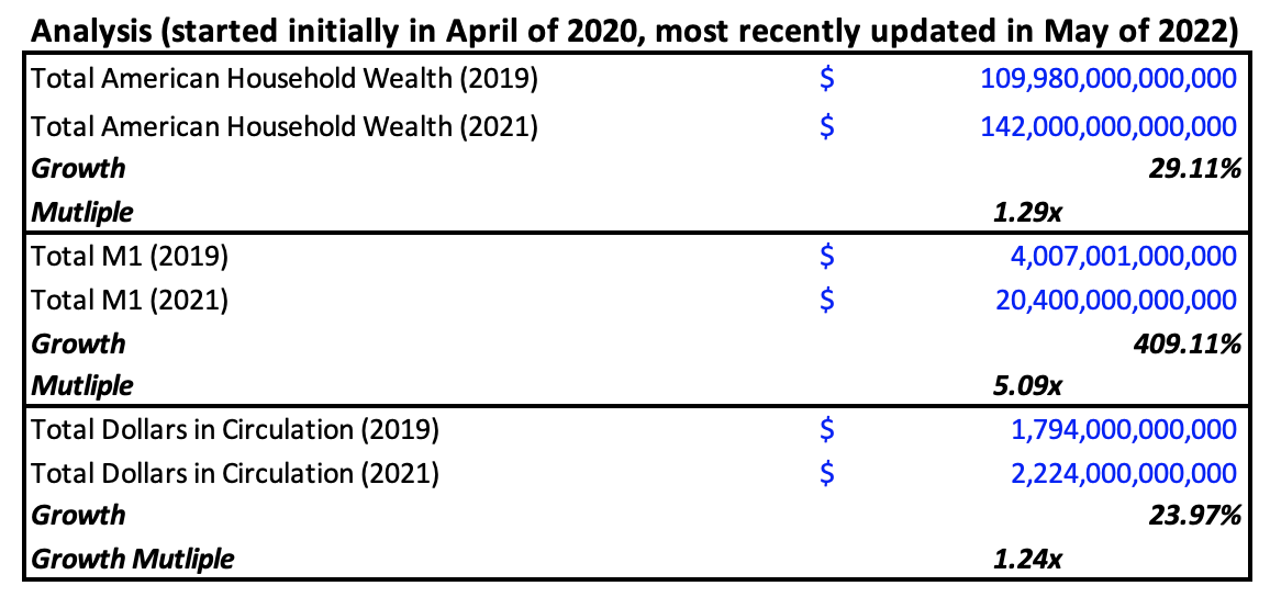
In 2019, this number was right around $109T. If you look at M1, or more liquid money that can be easily exchanged, this number was right under $4T in 2019. The last important basis of consideration is money in circulation, or the amount of dollars that get traded year over year. In 2019, the total amount of dollars in circulation was ~$1.79T.
These three data points were established to help bring forth three different frameworks to look at the inflationary effects of government stimulus bills over the last two years that were previously mentioned: Trump’s “CARES Act” and both Biden’s “America Rescue Plan” Infrastructure Bill.
You can think about this like a 3×3 thought exercise in order to consider how inflation “should” play out, based on: three bills and three bases of comparison (household wealth, M1, and money in circulation). See the first numerical and written analysis below for a three-pronged analysis based on 2019’s numbers:

First, total household wealth. As mentioned above, in 2019, this number was ~$109T; this is probably the most realistic number to look to when measuring inflation. At this basis, the compounded effects of the three bills should result in ~4.82% inflation, something we quickly started to see last year, and over 2.4x the Fed’s target inflation rate of 2%.
As you can see, using either money in circulation or M1 as bases of measurement to analyze inflation leads to some pretty unbelievable numbers. However, we have seen numbers near these ranges in select asset classes like food, used cars, and energy during this recent time period. This is primarily because of such a sharp up-shoot in the amount of dollars floating around met with supply chain issues and a lack of productivity worldwide- something we have been talking about and predicting for over a year.
Where it gets really interesting is when you look at what happened after 2019.
Money in circulation has been growing, perhaps a bit faster than usual, but still at what seems like a normal amount. The total dollars in existence, however, increased significantly to ~$142T, or nearly 30%.
Even more intriguing, from April to May of 2020, total US M1 increased more than three times, from around $4.7T to well over $16T. From 2019 to 2021, M1 increased more than five times.

As you can see below, even with these adjusted / updated numbers from 2021 (as a timeframe of thinking), the most conservative look (household wealth) on the compounded effects of the bills shows a significant amount of expected inflation right around 3.73%, or 1.87x above the Fed’s target inflation rate of 2% (see assumed marginal impact on the target inflation rate in the far right column).

What does this all mean, why did that happen, and where is all this money coming from?
The Fed’s actions during Covid were some of the most drastic ever put into action, specifically historically low interest rates, but they also changed a long standing rule that alters the definition of M1 to include people’s savings accounts.
The rule change can be found within Regulation D, and what they changed was to allow more than six bank transfers a month from savings accounts- the previous limit. This change of rule made savings accounts so much more liquid that it can now be included in the definition of M1 for the first time in history, which explains the insanely sharp increase in M1 of nearly $12T in less than two months.
However, since the definition changed, M1 has still increased by around $4T, which represents nearly a 30% growth in just those last two years since the definition change. It’s hard to establish assumed growth rates and say whether this secondary sharp increase is truly much faster than it has been historically or not because savings accounts have only so recently been included in the M1 calculation.
$4T does seem to be a lot of money, but for this reason, while we do continue to look at M1, we want to reiterate the importance of looking at different, related metrics like household wealth and dollars in circulation in order to keep this “new” metric in perspective.
Specifically interesting to look at here is dollars in circulation, which is still only around $2T, has not seen unusual growth, and is significantly less than the increase in M1.
These last two datapoints together perhaps reveal some incredibly interesting takeaways.
First, it spears that stimulus checks during the pandemic did not necessarily make people buy more things at too meaningful of a clip broadly. In the same time period that M1 increased by around $4T, the total additional money in circulation only increased by less than $450B- around a 10x discrepancy.
For context, Tesla’s market cap, discussed in more detail below, increased nearly $700B from its 52-week low to 52-week high, or 62% more than the increase in M1.
The “CARES Act” included ~$300B in individual stimulus checks (less than 50% of Tesla’s 52-week market cap delta) and $260B in unemployment benefits. This collective $560B is still nearly 20% short of Tesla’s market cap delta over the last 52 weeks… and Tesla is just one of the 500 companies within the S&P 500, and not even the largest.
The explanation for this unbelievable amount of capital movement is A. large institutions and B. financial derivatives. This is an old chart, but it does a good job helping the visualize the stunning impacts of financial derivatives on money markets.
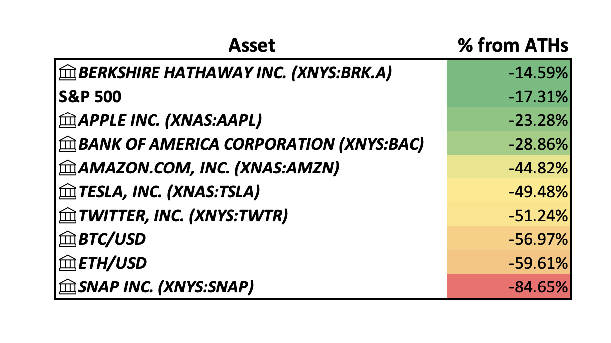
Amazon is another interesting one. At the end of 2019, Amazon’s market cap was right around $920B. At the end of 2020 it was $1.63T, a 77% increase from 2019 and a delta of over 35% above the change in the total amount of all dollars in circulation from 2019 to 2021. It now sits right around $1T, or down around 45% from its all-time high market cap of ~$1.88T.
Were the Fed’s dramatic actions too much?
It appears so, just based on the assumed (and now evident) inflationary impacts alone, given that the Fed’s job is to keep or target inflation to be around 2%. The simplest math here shows that very likely the second stimulus, if not certainly the third, would result in inflation beyond the Fed’s target which means that interest rates should have been raised much much sooner, perhaps even as soon as over a year ago.
So yes it seems that they may have pulled one too many levers at a time while the government passed one or two too many spending bills. Not only with the change to Regulation D, but the alarmingly low interest rate environment caused a never before seen flare up of financial derivatives, creating essentially unlimited lending. Of course, these actions have been to curtail the economic disaster that was caused and is still going on because of Covid.
The biggest question from here is if there is still the chance of a safe landing? Powell thinks so, and so do we. This crash, while bad, isn’t even as bad as some of very recent history…
S&P 500’s Market Cap
To establish where we are today (and to prime why that is important), we need to take a more recent look at large assets to see where they are and what has happened to them over these last two years.
A beautiful and massive way to look at this is through the S&P 500. In 2019, the S&P 500’s total value was right around $21T. By the end of 2020, more than $10T of value had been added, nearly double the total amount of stimulus spending between both Trump and Biden.
By the end of 2021, the total value of the S&P 500 was right around $40T, or nearly 100% growth in two years.
Upon Covid news in early 2020, the S&P 500’s market cap crashed from $26.8T to $21.4. Not lower than its value at the beginning of 2019, but still a ~24% crash. As of March this year, the S&P 500 sits around $38.3T, down less than 10% from its very recent all-time highs of ~$40.3T reported at the end of last year. Currently it is down ~ 20% from all-time highs. In 2008, it crashed well over 50% before we saw signs of a recovery.
Based on historical crashes, it seems like there is still perhaps a certain degree of over confidence or an overvaluation the companies.
Let’s take a look at some specific assets…
Specific Assets’ Market Caps
Next, it’s important to look at relative value, by this I mean the dollar amount behind some of the largest assets in the S&P 500 like Tesla, Apple, Amazon, and more.
Apple is undoubtedly one of the most impressive companies to ever exist. Their products alone could make that statement true, but what is perhaps even more impressive is their cash flow and retention. As of February 2022, they had over $200B of cash and investments, even after buying back $81B of their own stock last year.
The two most important things to look at here though are market cap and share price. If we look at Apple’s share price right now, it’s at ~$142/share, down around 27% from its all-time high of ~$180. Now Apple has seen its fair amount of volatility, crashing around 60% in 2008, ~40% in 2012-13, and over 35% during the Covid crash.
At the end of 2019, Tesla had a market cap of under $100B. At the end of 2020, it had a market cap of over $600B- right around where it sits today, and up over 750% from its 2019 market cap. Its all-time high market cap was $1.23T.

Tesla is down around 50% from all-time highs and we believe that for the first time in its operational history, that Tesla is starting to be properly valued based on actual cash flow and the economies of scale that they with soon achieve based on a significant amount of investments into R&D throughout the last number of years.
For example, if you look at the assumed stock price in 2025 according to our Discounted Cash Flow model, the stock would come in at around $928/share, or a 1.4x of where it is at time of the writing ~$665. If you look at historic growth rates, however, and push the analysis out to 2027, the implied share price would be ~$2,500, or over a 3.75x of today’s price. In 2030, it is even more dramatic at over $10,000/share, or more than 15x the current share price. Please note that the tax growth rate has been manually adjusted in the model to represent more realistic growth.
Comparing Tesla to Twitter, which has been called the worst company in the S&P 500 and struggled significantly since banning Trump, Jack Dorsey stepping down, and their share price tanking even after Elon announced his interest in purchasing. Based on the same DCF analysis done on Tesla, it appears that Twitter is a low margin and perhaps even dying company.
According to our DCF model for Twitter, in 2025, the stock would be worth significantly less than it is today, at just over $25.5/share. It would take them until 2027 to break even and even in 2030 it would only represent a 1.86x opportunity for growth.
Keep in mind this is strictly based on cash inflows and outflows based on historical data and has no bias towards Elon offering to buy it or not- just as the Tesla model doesn’t have any particular bias about their massive new gigafactory in Texas. For Twitter, I have even tampered down the assumed growth rate for their R&D spend because it seems like it has been growing much too fast to justify even staying in business if it were to continue at that rate.
Based on this discussion and comparative analysis, Tesla is primed for growth based off of their historical track record of growth but also because of the magnificent scale that they are close to achieving, as evident in recent financials. Twitter, on the other hand, is likely not going to be very relevant soon unless Elon is truly able to take it over and completely revitalize it. Their financials have been bad and are only getting worse. Something significantly bringing down their projections, for example, is an unusual “Litigations Settlement” cost of over $765M in 2021.
As we look towards the future, we encourage anybody and everybody to play around with our models, attempt to run some of their own numbers for companies they are interested in, change with the numbers, and get back to us on any feedback that you may have.
In Conclusion…
Unprecedented actions by the Fed to stop an economic standstill flooded all sorts of money markets with capital and created a massive slue of financial derivatives in the form of NFTs, SPACs, 100x revenue multiple public companies, lots of debt, and much more… which is now leading to massive drawdowns in all of those markets, as well as even more sturdy markets as well. This is A. because all sorts of people and organizations were over-levered (and likely less liquid than they usually are) and B. inflation + lack of production + supply chain difficulties are starting to have a bigger and bigger impact on more and more people’s everyday lives.
But everybody knows and is observing this, the important question is, is the dollar okay? What happens from here? Is what the Fed doing now enough? Or too much again? This time in the wrong direction.
The good news is the dollar is still doing decently well on the global stage. After looking at current, 5-year, and maximum dollar value relative to other major currencies like the Yuan, Euro, and even Ruble, however, it’s safe to say that at least in the short term, other than foreign countries starting to make oil deals in currencies other than dollars, the dollar is fine. I believe we can get out of the mess we have gotten ourselves into if we handle it properly.
The comfort is that at least if our currency has become devalued by extraneous inflation, the rest of the world is right there next to us for similar reasons. The scary part in that if not properly handled by economists and global leaders, even worse inflation on a global scale could be on the horizon. Hyperinflation is no joke, but even moderate inflation means hardship for families, changes in lifestyles globally, less travel, less production, even less education, and much more.
Inflation isn’t bad if productivity can catch up with it. The bad news is that between Covid, massive changes in work ethic across generations, and perhaps an immigration policy that lacks sophistication across political parties, production in American is not necessarily on the rise like it has been in the past.
Another problem is that the Fed was certainly late to raising interest rates, but now they are raising them faster than they have in 20 years at a time when CPI is still increasing, but at a slowing rate for the first time in the last two years.
It’s hard to say exactly what will come from this, but we unfortunately think it is going to get at least a bit worse before it gets better, as discussed further in the “Specific Equities’ Market Caps” section.
We hope in the long-term, however, that this crash will weed out the fakers, those just doing the bare minimum to get by and those that are there for the hype, in all industries but especially in ours. We hope that it will leave the best, brightest, and most passionate.
Hopefully more creatives, producers, creators, inventors, artists, and geniuses come to light to share their beautiful products, services, and work with the world.
Hopefully we can learn how to work together to solve problems.
At Black Mountain, we aim to be the voice of a generation of positive collaborators, those who give more than they take and work to propel the world and humanity in a positive direction.
Thank you for taking the time to read this, we hope you enjoyed and found it helpful. If you did, we’d greatly appreciate it if you could share with friends, family, co-workers, etc.
Wishing you well!
All the best,
The Black Mountain Team


0 Comments